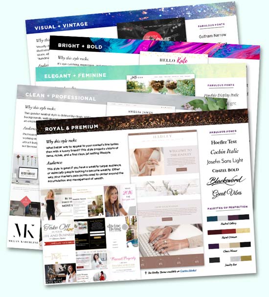
Your Signature Brand Style is
Visual & Vintage
If you haven’t already, CLICK HERE to get your detailed results, video, plus BONUS cheatsheets delivered straight to your inbox!
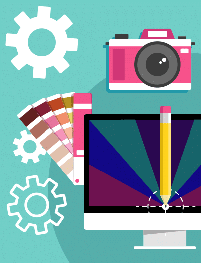
What makes a brand Visual & Vintage?
Experimental with photography, typography & pattern design
Use of patterns and color blocking to separate elements on a website
Vintage styles & photography used in new and exciting ways
Get the complete style guide + BONUS font & color palettes for just $7
Potential issues to watch out for...

No rest for weary eyes
Sometimes, less is actually more!
To give your visitors a bit of an eye-break, it’s a good idea to separate your dense, photo-heavy sections with clean, content-driven white space sections.
Using intermittent color blocking and big, bold text sections on white backgrounds can help space out your more eye-popping areas.

Not enough photo variety
Since this is a very photo-dense style, you need a lot of different options to choose from. I don’t just mean lots of different portrait shots to choose from – you also need variety in the types of photos you take in the first place.
You need some close-ups of you working with your hands, engaging with a hobby of yours, and LOTS of environment shots that don’t show your face at all.
If you’re looking to take better promotional photos in your next shoot, here’s a super handy FREE guide I created for this purpose.

Not cohesive enough across the whole brand
It’s an extremely daunting task to DIY this style without real world design experience. A novice will likely go overboard, and your designs, branding & website will lack cohesion.
Creating an overarching design theme is critical with this kind of style, so if you’re hellbent on the DIY route, think big, focus on finding inspiration to follow, and whatever you do – keep your design consistent across your entire brand.
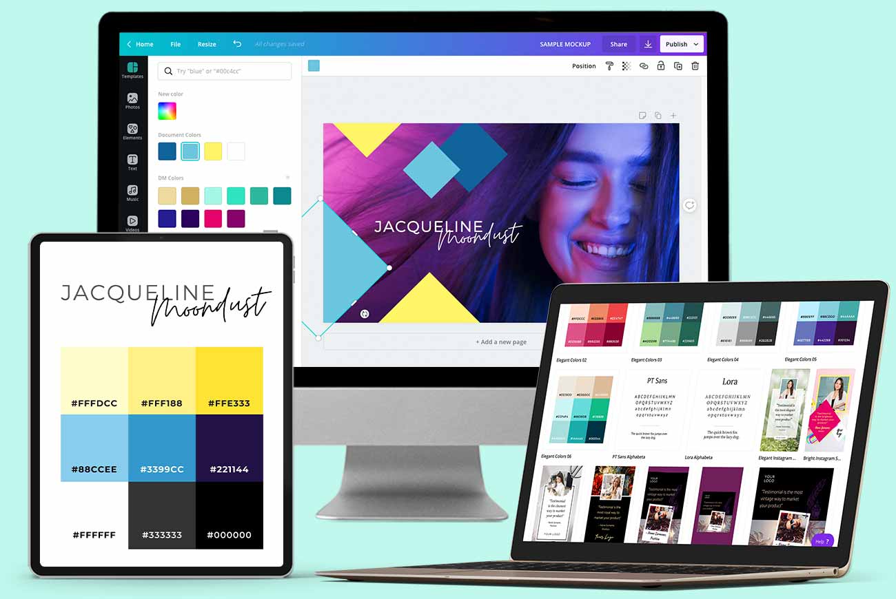
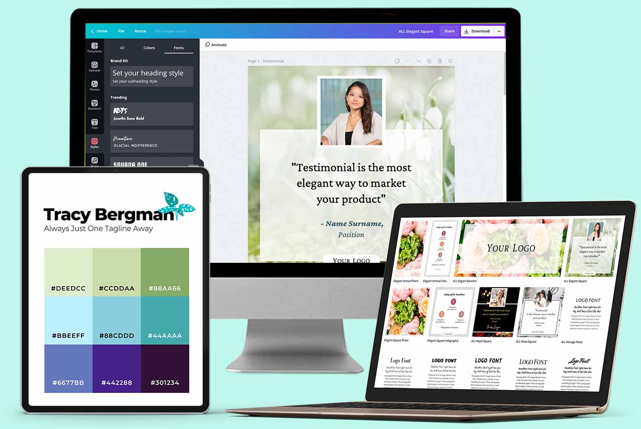
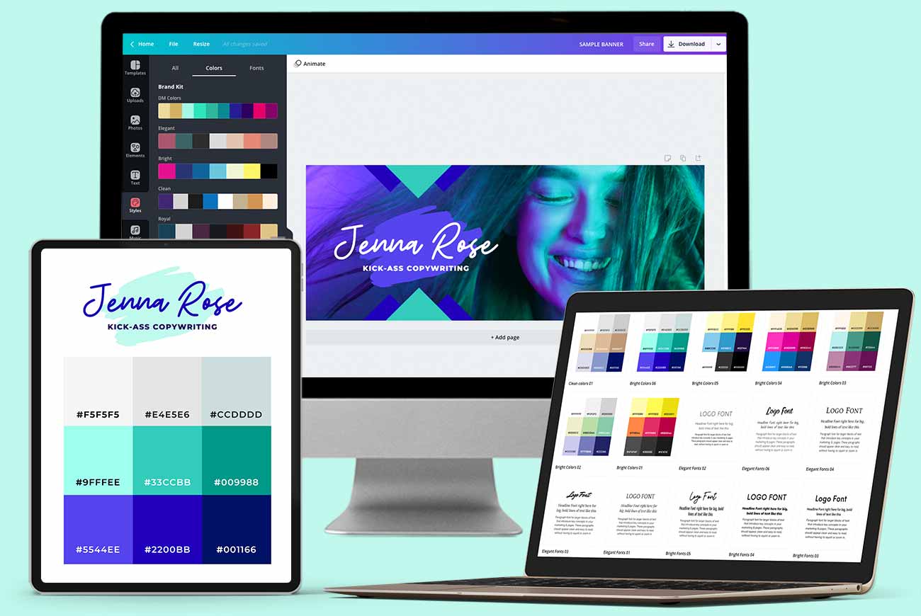
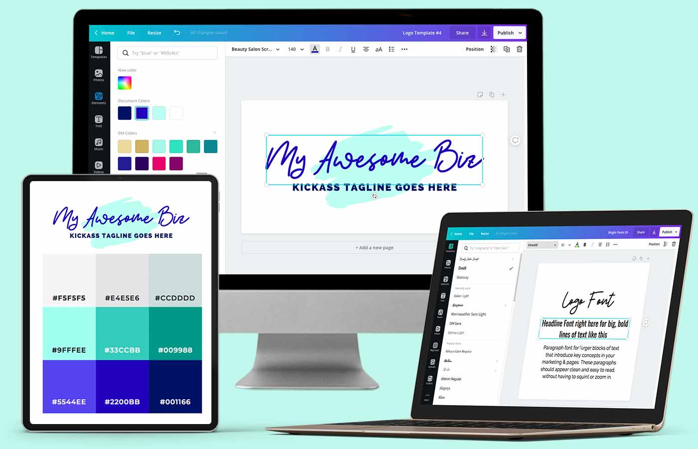
Featured Bundle
Complete DIY Brand & Marketing Kit
Huge set of plug-and-play logo + social media templates for Canva. Featuring 5 x unique styles to help you kickstart your online influence.
Looking to invest in done-for-you services?
Signature Brand & Website Packages
When you need a tech-savvy, high-converting website that brings in new business while you sleep.
When you need a tech-savvy, high-converting website that brings in new business while you sleep.
- Amp up your marketing with a beautiful, professional, and easy-to-update website
- Highly customizable & grows as your business grows (unlike Squarespace or Wix)
- Includes detailed training that builds your confidence as you use your new website
- Show off on social media with gorgeous, cohesive brand assets (fonts, colors, etc)
Laura's web design and development is exceptional...
She heard all my requests and was incredibly patient with all of the custom details I asked for. The end result is worth so much more than the price I paid and honestly, I can’t believe I got such incredible value.
I recommend Laura without hesitation. In fact, I’ve been recommending her to friends, colleagues, and clients for the past 6 years we’ve worked together!
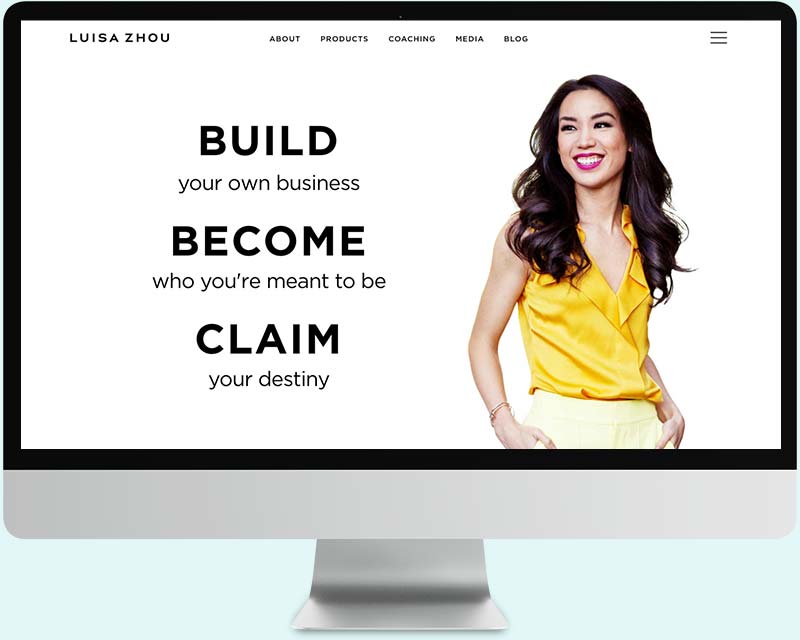
- Luisa Zhou
7-Figure Business Coach, LuisaZhou.com

Laura, I feel so blessed.
You nailed it way better than my little brain could’ve ever dreamed it up! I’m so so happy with the design!!! It is just gorgeous! Your design just nails everything I hoped to encompass and more. I can’t express that enough.
Thank you so much for helping my dream become reality. Could not have done it without you – that is for certain.
- Michele Rohde
Financial Advisor & Coach, MicheleRohde.org
My new web design DOUBLED my conversions!
I’ve collaborated with many designers, and I’ve never met one with a more impressive combination of visual artistry, technical savvy and “I’m on it” professionalism. (The Container Store looks disorganized compared to her.)
Oh by the way, the new webinar registration page she designed has doubled my conversions, from about 9% to 20%+!
- Connell Barrett
Dating Coach for Men, DatingTransformation.com

I wanted to reach out to say thank you again for the design of my website.
I was offered an opportunity to be a recurring guest on an Atlanta based tv & radio station based on what she saw on my website!! Thank you!
- Beverly Walthour
Business & Sales Strategist, BeverlyWalthour.com
What are you waiting for?
Let's get this party started...
Hey there! It’s your girl Laura.
I help entrepreneurs & small businesses stand out online with high end branding services, web design and development.

Every pro knows that if you want to stand out from the competition and convert your audience into loyal clients, you can’t settle for the same old cookie-cutter designs you see everywhere in your industry.
I created the Signature Brand Style quiz, cheatsheets, and marketing toolkit to give you a major shortcut, so you can use these fonts, colors, and inspiration as a jumping off point to bring your OWN uniqueness into your designs.
Copyright © Design Mastermind all rights reserved.
We respect your email privacy.
Terms & Conditions | Privacy Policy
For support issues or questions, please email us at [email protected]