#1: What is brand identity? Do I need an icon?
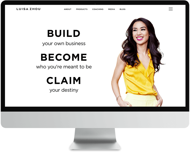
– Brand identity is the face of your business. It’s the photos you use, the fonts you choose, and the colors you add to your buttons and headlines. At the front of it all, is your logo.
– You don’t need an icon with your logo unless it’s an actual business (vs. solo entrepreneur). If you’re a solopreneur, just focus on finding a beautiful font for your name or business name. If you hire a designer down the line, they can help you create an icon. They can get complicated (requires knowledge of vector illustration) and I don’t recommend it for beginners.
#2: How can I branding myself as premium from the beginning?
– If you’re serious about your business, it’s best to put your best foot forward right away by branding yourself as a premium service. “Fake it ‘till you make it” and “dress for the job you want, not the job you have” principles apply here.
– You can brand yourself as premium (even if you have a low budget) by looking at 3-5 premium brands and drawing inspiration from…
1. The fonts and colors they use,
2. The way they lay out content on their pages
3. The overall look & feel that you get from visiting their website
4. The way they design their freebie or PDF resources
– Ultimately, you can be inspired all you want, but you can’t learn design overnight. My advice is to keep it SIMPLE and clean until you’re ready to invest in professional design work.
– Every new entrepreneur gets a bit of imposter syndrome. That means that you feel like you’re not worth the prices you’re asking, or the top-tier look that you or your designer have created. What you’re doing is giving yourself something to work up to. You’re setting the bar for YOURSELF, since no one else is around to set that bar for you any more. Acknowledge your expertise and gain a little more confidence every day you sit down to work
#3: What are some top trends in web design, and can you give advice on how to create a professional, clean look even as a novice?
– Photos are the king! If you have to invest in anything right off the bat, invest in a really good photographer. That way you will have plenty of backgrounds to use throughout your site. Parallax backgrounds are super popular (and easy to add to Squarespace) so look into this if you’re looking to shake up your website layouts.
– Be aware of spacing on your page – you want to give your eye room to read. Where possible, increase line-height and add top and bottom padding to your content rows (at least 30px between each row). Spacing out your content is a great way to make your website feel more “luxe”
– Choose clean fonts! Here’s a great resource for picking out fonts: http://fontpair.co/
– BIG HEADLINES are super popular. Gone are the days where people have the time to sit and read paragraphs of text. Break up your paragraphs and add BIG HEADLINES and secondary headlines throughout your page content
– When you have the option to customize buttons, make them ALL CAPS, with no rounded edges or shading. Dark buttons with white text always look nice, especially if you can change the background on hover (makes them super clickable)
– Hand-illustrated design elements are becoming a popular alternative to super flat icon designs. If you like to draw or want to learn more about turning your drawings into design elements, shoot me an email!
#4: What is a “graphic” when talking about brand identity?
– If you hear a designer use the word “graphic”, they are usually referring to images that are created (using Canva or Photoshop) that contain any combination of photos, design elements, and text.
– The graphics you create should have a consistent style, and when viewed together (on your website, landing page, or even printed resources or business cards) create the look & feel that you want your brand to represent.
– To create consistent graphics, make sure that your photo style, colors, and fonts are pretty standard across all of your materials. I recommend sticking with one or two photo styles (sepia, black & white, colorized, bright, moody, etc.), 3 different fonts (decorative / script, headline, and body / paragraph), and 3-5 colors.
– Be sure to write down your fonts and color hex codes and keep them on a notecard as you practice your design!
Stay tuned for Ask a designer part 2: Website platforms demystified!