Simple design & POP colors create memorable brand experiences.
Sometimes having a LOUD taste really comes in handy – especially when you’re looking to create a brand that stands out from others in your field. What sets this Signature Style apart from the others in my collection is the intentional use of bright color and contrast to highlight important areas of interest on a page.
With a Bright & Bold brand design, you can easily promote specific parts of your business while letting extra information take a backseat. Calls to action, headlines, and important product info can be highlighted using bold, expressive colors. And are MORE likely to draw attention to the parts of your site that matter the most.
Color is king.
Bright & Bold websites are similar to Clean & Professional in that both use the “less is more” philosophy and don’t overload visitors with content or funky imagery.
By giving your audience more visual space, and drawing attention to specific areas of interest (using bright colors), you have much more control over the experience you want to create.
Although bright colors create more visual engagement than clean, modern brands. These types of websites & sales pages still give the eye lots of “room to breathe” in between sections. And keep the amount of content on each page / section to an absolute minimum.
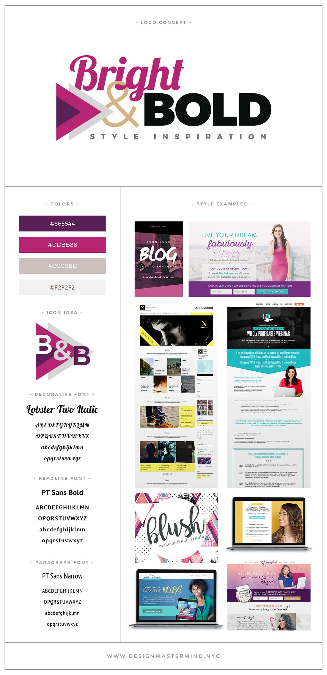
When designing for a Bright & Bold brand, the most important thing to consider at the get-go is which colors to include in your palette. You’re going to want to establish a “foundation” palette to get started, as well as a “highlight” or POP palette to use across various sales pages or promotional materials.
Creating an eye-popping highlight / pop palette will give you more options when it comes to branding individual products or services. For instance, if you have a highlight palette that includes bright yellow, teal blue, and hot pink, then you can choose teal blue as your main color for a new course you’re promoting. You would want teal blue to then be the primary POP color used in your course materials, freebie promotions, and the entire sales funnel.
You’re essentially creating a “mini-brand” palette that puts more emphasis on one pop color vs. the others (which are still used, but not as prominently). When it comes time to promote a NEW product or service, you can use a different pop color from your palette to help set it apart from the rest of your offerings.
This is an excellent way to maintain brand consistency while giving your audience a way to differentiate between your groups, courses, and/or freebie promotions.
 Here are some key traits that might mark a brand as bright & bold:
- Can appeal to any specific demographic – all depends on color choice
- Simple, “foundation” color scheme with 3-4 bright highlight / POP colors added as well
- Less dependent on photography. Great for studio photos, since you can easily add pops of color on top of any flat white (or grey) background.
- Simple decorative elements, nothing too fancy.
- Plenty of different colored background areas create variation on long pages
- Some bright & bold design elements include flat shapes, thick text, and colored backgrounds
- Icons look great “cut out” of bold colorful backgrounds. White icons over colorful backgrounds vs. colorful icons with a white background.
What makes a Bright & Bold brand style different from the other brand Signature Styles?
Bright & Bold brands…
- … have much brighter color palette than Clean & Professional brands
- … use fewer decorative design elements than Elegant & Feminine brands
- … feel more “in your face” and less delicate than Royal & Luxe brands
- … don’t use many patterns or graphics, like Visual & Vintage brands do
You might want to brand yourself as Bright & Bold if…
- Your clothes are super colorful, and there’s a few colors that you tend to buy more often.
- You prefer abstract art and design. Mondrian, Kandinsky, Rothko, and Pollock – HELL YES!
- You’re more of a minimalist than a maximalist.
- You’d much rather be loud and center stage, rather than pulling the strings from behind the curtain.
- You place emphasis on content over style, and hate when a site’s visual graphics or overly complex layout gets in the way of a straightforward user experience.
Audience preview
Bright colors say more about the brand than the audience. Since audience targeting with this Signature Style really depends on which POP colors are chosen.
Female-oriented pop colors include cooler tones such as pink, teal, and purple.
Gender-neutral pop colors include green and sky blue, as well as warmer tones such as red, neon yellow, and orange.
Since women are more visually driven, this Signature Style is extremely popular with businesses who cater to a female audience.
Potential issues
Clashing color tones
The biggest issue I’ve seen with this Signature Style is choosing POP colors that don’t go well together.
As a general rule of thumb, you want to pair POP colors with similar levels of saturation.
For instance, if you really want to use a less saturated gold color, you won’t want to pair it with anything hyper-saturated or neon. Instead, choose other less-saturated colors, such as fuchsia (vs. hot pink), purple, or burgundy (vs. red).
Visual overstimulation
You want to be selective with which POP colors you use on each page of your site. If you use too many bright colors or highlighted areas (which ALL cry out for attention) then your audience won’t feel directed and are more likely to bounce.
Not enough variety
Creating a more robust POP palette will allow you to vary the visual interest across your entire brand. However, if you use the same POP color everywhere on your site, your visitors are less likely to tell the difference between your offerings. It can feel like information overload.
When you separate each of your key services or offerings (using selected colors), then your audience will be able to digest one promotion at a time without having to “lump it in” with the rest of your brand experience. The offering will stand out in your visitors’ memory as something unique, which will ultimately determine whether they decide to invest or not.
Remember – the goal of all my Signature Styles is to create memorable brand experiences. And adding variety at every turn is the best way to expand that experience outward (and thus make it more likely to be remembered in the first place!) After all, the internet is a huge place.
Ideal fonts & colors
Modern fonts all the way! For this style, I like to pair chunky script / handwritten fonts (such as Abril Fatface or Lobster Two.) With sleek sans-serif fonts (such as Raleway or PT Sans). If you’re aiming to attract a more gender-neutral audience, then I like to choose a condensed font for headlines (such as Oswald, Bebas, Open Sans Condensed, or PT Sans Narrow).
When choosing colors, you should create a basic foundation palette (with simple colors such as beige, light blue, grey, and/or white.) And pair with an eye-popping highlight or POP palette (with neon colors, sparkly gold, black, and/or teal)
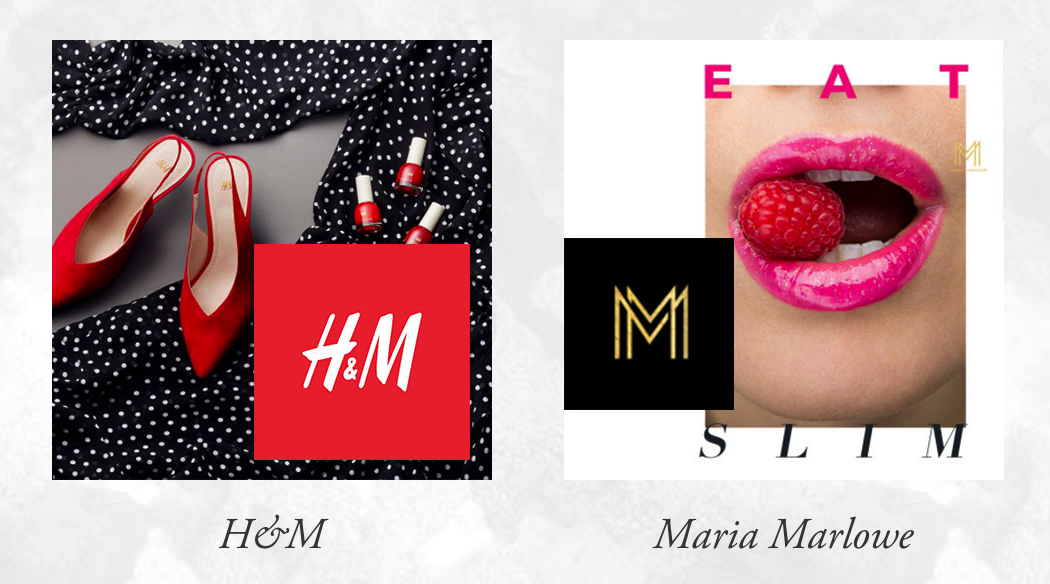
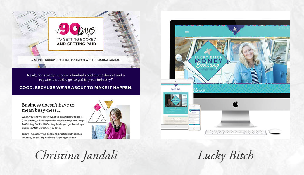
Brands to be inspired by
These brands do a fabulous job of using POP colors in their branding. Although these are more geared towards women, there are lots of Bright & Bold brands out there that cater to a male demographic as well.


3 Responses