Flat design with a crisp, modern edge.
The first of my Signature Style blog series is also the least “styled” look of all. Clean & professional design can also be thought of as modern design, which always takes a backseat to photography and content. If you’re looking to spend less time on Canva and more time taking photos or writing copy, then this may be the PERFECT look for you!
Less is More
What this Signature Style does best is what many novice designers and DIY divas lack the most – visual space. These types of websites & sales pages give the eye lots of “room to breathe” in between sections, and keep the amount of content on each page / section to an absolute minimum.
Another bonus – clean, minimal design is the foundation of most modern website templates. That makes it an extremely convenient Signature Style for you to adopt for your business. Even if you stick with the default options for drag & drop themes such as Divi, you’ll still wind up with a clean, well-spaced DIY site.
When designing a clean & professional sales page, the most important thing to keep in mind is “less is more”. You will also want to maintain at least 60px of padding in between rows / sections, or else your page will go from “clean” to “boring” real fast.
Here are some key traits that might mark a brand as clean & professional:
- Gender-neutral style
- Not much variation in the color palette – usually lots of white, grey, and black
- Bright, well-lit photos with clean, uncluttered backgrounds
- No extra decorative elements or dividers
- Selective use of borders and backgrounds to create variation on long pages
- Design elements such as foil or embossing might be used in place of printed graphics (on collateral such as business cards or letterhead)
- Icons, when used, are outlined or in a tiny format
 What makes a Clean & Professional brand different from the other Signature Styles?

Clean & Professional brands…
- … have more subtle color palettes than Bright & Bold brands
- … target a more gender-neutral audience than Elegant & Feminine brands
- … appear cleaner and less “high-end” than Royal & Luxe brands
- … don’t use as many patterns or graphics as Visual & Vintage brands
You might want to brand yourself as “clean & professional” if…
- You dress more classy than casual, and prefer neutral tones over anything bright or garish.
- Your house or apartment is tidy and uncluttered. You’d rather get a storage unit than have a messy closet.
- You tend to be extremely detail-oriented and meticulous with your work.
- You place emphasis on content over style, and hate when a site’s design gets in the way of a straightforward user experience.
Audience preview
This is the most wide-reaching of all the Signature Styles, since it doesn’t go out of its way to make any sort of specific statement. You can market this style to men and women easily.
The whole ideology of “clean & professional” is to keep things as simple as possible, which is appealing to professionals in any field. This style is especially appealing to people working in an office environment, who are accustomed to clean, straightforward design.
Clean, well-spaced layouts are especially attractive to busy people who are looking to get straight to the point. Often times, this market is NOT looking to explore your website and get a curated style experience. They want to read your content, and will base their opinions off the quality of your pitch.
Potential issues
Lack of specificity
Unfortunately, when you appeal to EVERYBODY, you can sometimes end up appealing to nobody. Specificity is one of the most important aspects to a successful Facebook ad campaign, so you’ll want to be very careful with how your brand appears to the people you’re most wanting to reach.
To sidestep this issue, be sure to test your campaigns (A/B if possible) over the course of 3-5 days. Use the data from each campaign to see what resonates best with your market.
High quality photos are an absolute necessity
Since decorative design elements aren’t really a thing with these kinds of websites, you’ll want to place even MORE emphasis on the quality of your photo shoot. Essentially, your photos will be the only thing that helps you stand out from the competition, so if you have dark, blurry, uninspiring photos, then you’re going to have a hard time running effective campaigns.
If you’re looking to take better promotional photos in your next shoot, here’s a super handy FREE guide I created for that exact purpose.
Blending in, not standing out
I mentioned it above, but without a distinct brand style, you might lose the interest of people who are skimming their feed, only giving attention to the images and designs that pop out the most. When you keep your branding super minimal, it can be all to easy to fade into the background.
One important way to get people’s attention is to choose one darker “contrast color” that you can use to highlight important calls to action, buttons, etc. You can also use this POP color as a background, to help your graphics stand out against an otherwise white background.
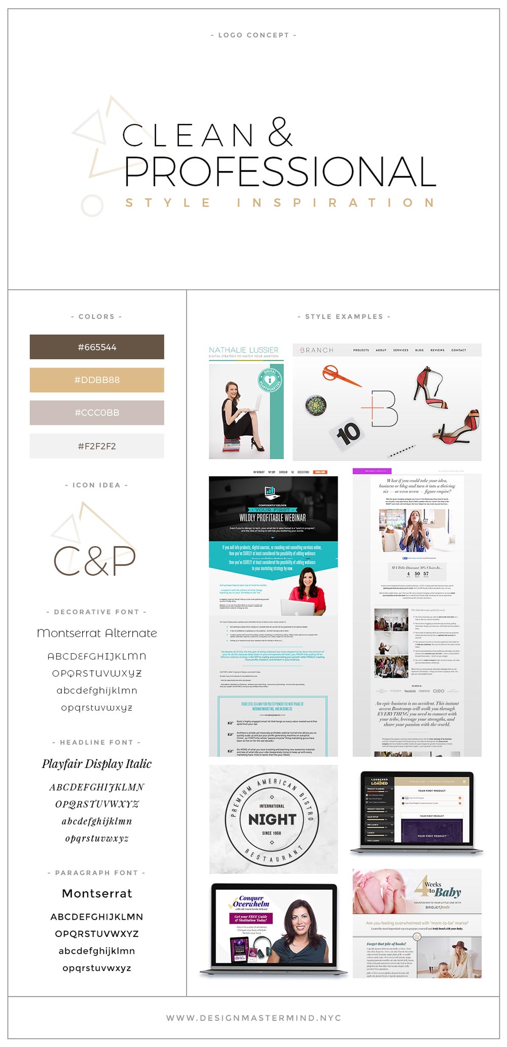
Ideal fonts & colors
Ideally, you’ll want a combination of classic, serif fonts such as Adobe Garamond, coupled with clean, modern fonts such as Gotham, Open Sans, or Proxima Nova Condensed.
When choosing colors, you’re going to want to stay as light & neutral as possible. However, as I mentioned above, you should ALSO choose one darker or much brighter color to highlight important text, sections, or calls to action.
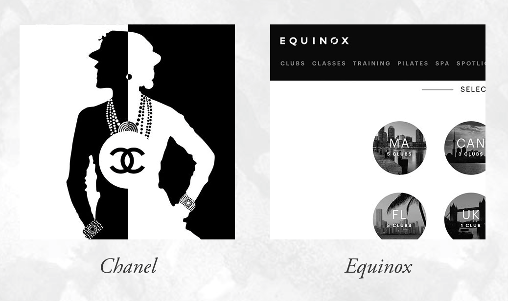
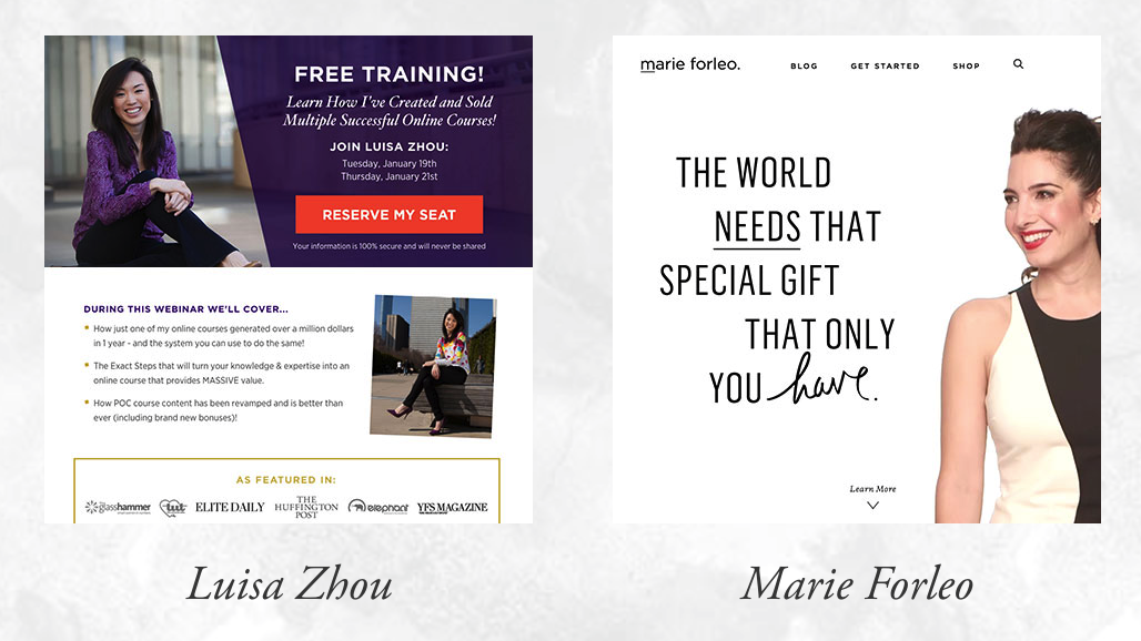
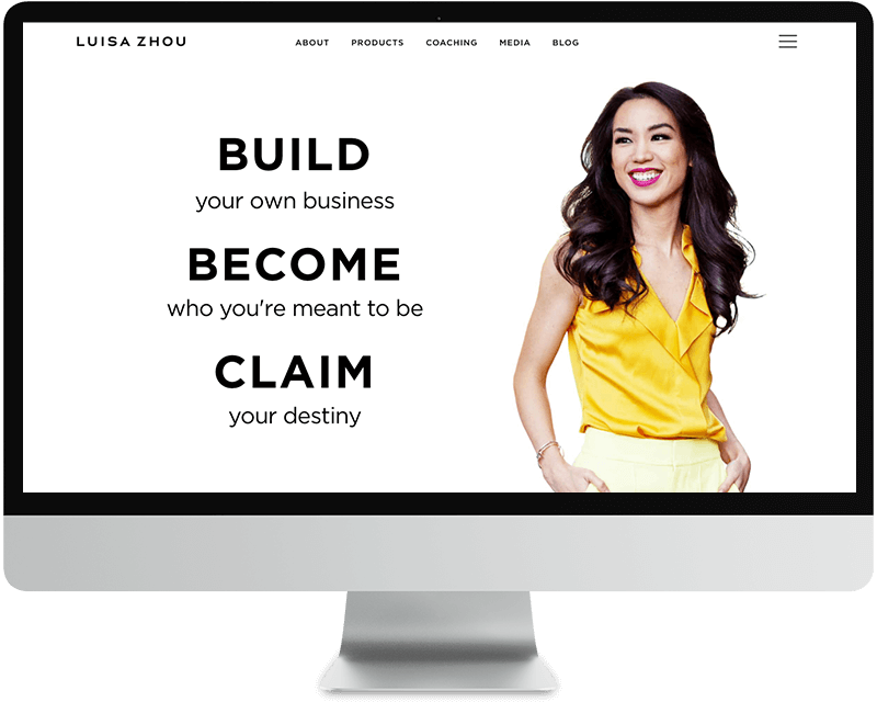
Brands to be inspired by
There are SO many brands that incorporate the clean & professional design aesthetic, but here are some examples to help inspire your designs & layouts moving forward:


4 Responses