A polished, high-end look for premium brands.
You want the luxe life, and you want to work with people who have the same high-quality taste. You take the reins when it comes to planning and setting high financial goals – you’re fully committed to creating a business that gets you the best kind of high-class lifestyle. The aesthetic you’re going for isn’t just sleek – it’s downright enviable.
 A brand experience for an audience with discerning taste
Creating a Royal & Premium brand design to match your Royal & Premium taste means you need to LOOK, well, you guessed it – Premium. Unless you really know what you’re doing when it comes to design, I wouldn’t try to DIY this kind of website.
You get what you pay for when it comes to brand & website design, so practice what you preach and invest in quality brand materials from the get-go.
Be selective with who you bring onto your team for brand & web design work.
Don’t hire a VA who knows some Canva. Not even a VA who claims to have built a few websites. You need a professional web designer with a high-quality portfolio.
I’m not just advertising for my own business – this is the ONLY type I explicitly recommend hiring out before ever attempting to DIY. If you try to go cheap with this audience, it will show and you’ll lose credibility before you even get your feet off the ground.
 Here are some key traits that might mark a brand as Royal & Premium:
 Here are some key traits that might mark a brand as Royal & Premium:
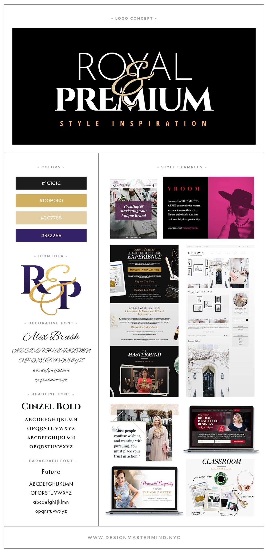
- Clean, polished, gender-neutral style
- Color palettes on the darker end of the spectrum, with deep purples, maroons, blacks or dark greys
- Bright, luxury-focused lifestyle photos with lots of white, gold, black, and/or marble
- Simple, delicate elements used in dividers and photo embellishments
- Selective use of dark backgrounds and premium photography to differentiate between sections on long sales pages
- Use of gold foil, marble, and other luxury textures in overlay and background patterns
- Simple, thin line art and icons make a good impression with this demographic, especially paired with dark, rich, marbled backgrounds.
What makes a Royal & Premium brand different from the other Signature Styles?
Royal & Premium brands…
- … use more premium-looking colors, photography, and decorative elements than Clean & Professional brands
- … have darker color palettes than Bright & Bold brands
- … target a more gender-neutral audience than Elegant & Feminine brands
- … don’t use as many colors, patterns or graphics as Visual & Vintage brands
You might want to brand yourself as Royal & Premium if…
- You prefer to invest in high-end luxury brands
- Your target audience prioritizes wealth and/or travel, and sees themselves as deserving of the finer things in life
- Your plan is to offer products or services at a high price-point
- You place a lot of emphasis on setting high goals for yourself, and projecting a high-class image of yourself. You feel your clients and customers want the same.
Audience preview
This audience values high-quality products and services, and believe that you need to spend money to make money in any industry.
People of all kinds are attracted to this Signature Style because of how design-conscious it looks. Lately, many of my favorite sales pages and brand designs have fit this style, making use of dark / light contrasting elements, plenty of white space, and beautiful detailed line art.
Potential issues
Inexperienced designer
I’ve taken on more than just a few clients who wasted money on an inexperienced VA or designer in order to save money at the start.
The truth is, it’s worth just saving up for a quality web designer and starting out with a nice-looking theme that you install yourself. There’s tons of fantastic options out there, just keep it as clean & minimal as possible to start – save the real style work for your future designer!
Difficult to differentiate
At times, I’ve felt inundated with similar looking brands that use this Signature Style.
It’s easy to stick to the style go-to’s – gold, shine, sparkle, marble, black, and calligraphic. Stand out by expanding what it means to be Royal & Premium – choose dark, rich fuchsia instead of maroon, try rose gold instead of yellow gold, check out Google Fonts’ handwritten collection instead of jumping straight to calligraphic.
No more filigree than absolutely necessary
One important design principal to keep in mind is the value of taking things away. Once you establish an initial design, ask what parts are absolutely critical to achieving the look you want, and remove the rest. Do you need that second divider? Every single bullet section is something different – why not choose the best 1 or 2? How many kinds of box section designs can you find on one page?
Ideal fonts & colors
For headlines, a popular option is “all caps, spaced out, sans-serif” which always gives a “high-end design” feel. It’s also nice, visually, to combine clean, sans-serif headline fonts with a beautiful, easy-to-read serif font for paragraphs.
When choosing colors, it’s more about creating the mood using beautiful design, and colors are secondary to the overall “Royal & Premium” experience. Popular combinations include black and white, or any combination of purple, fuchsia, black, and maroon.
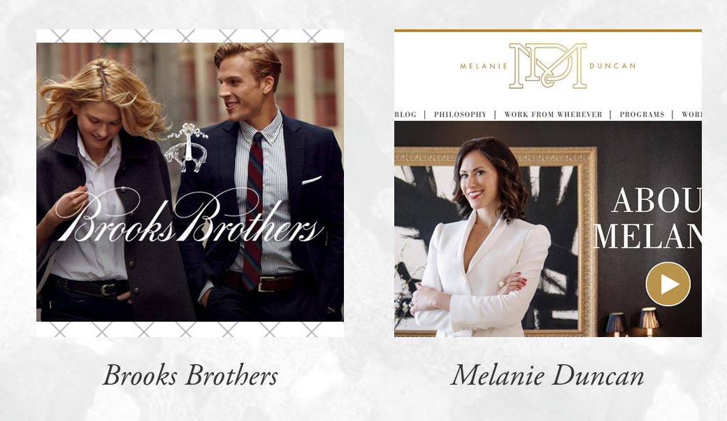
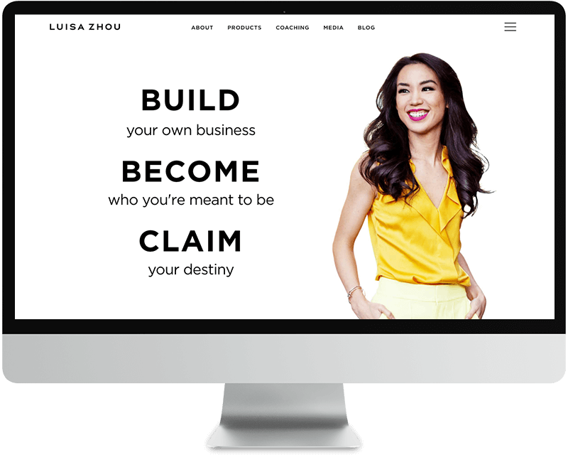
Brands to be inspired by
I’m in the process of collecting more brand examples to post here, these are just a few gorgeous examples for you to research, pin, and share with your designer.


One Response