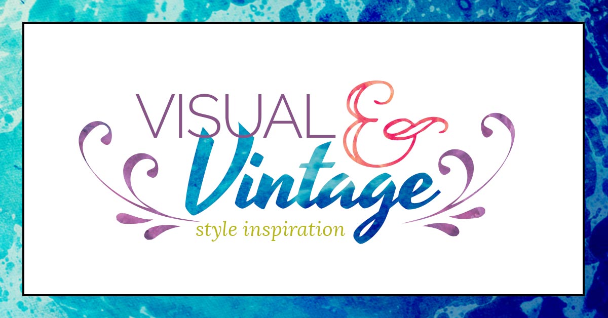
Gorgeous. dense. loud. Anything but boring.
The most “maxed out” of all these design styles, Visual & Vintage brands crank the volume up to 11. When you look at a Visual & Vintage website or logo, you get an immediate impression of what that brand stands for and what their personality could be like. It’s very easy to paint a picture when there’s so much to take in.
These are businesses who consider themselves on the vanguard of their industry, and strive to communicate their own personal style to an audience that’s probably obsessed with how unique and visually engaging their website and resources look.
 So many ways to play
This style appeals to artist in each of us. Visual & Vintage brands like to push boundaries and set themselves apart as a completely unique experience.
With this Signature Style, it’s quite easy to appeal to a specific niche in any industry, as long as you know what your audience likes and bring those interests into consideration during the creative process.
When you choose this style, it’s super important to know exactly who you’re marketing to and what sort of style they find appealing. Yes, you’re expressing your own style here, but there are SO many ways you can take a “visual” brand, having crystal clear direction from the get-go will save you from having to re-invest later on for different photos or a different site design.
The more design elements your brand has in play, the more options you have as well, and this style takes it to the MAX.
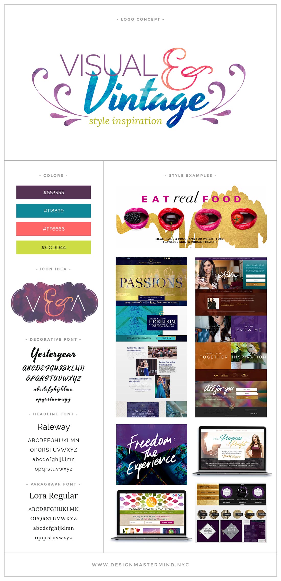
Visually dense brands tend to combine line art or illustrations with their photography. These sales pages & websites don’t have much white space, and use abstract textiles or patterns to give an old-school, “handmade” feel. “Handwritten” typography pairs especially well with this style, since brush or script fonts compliment the cozy, personalized feel you get from Visual & Vintage brand experiences.
Here are some key traits that might mark a brand as Visual & Vintage:
- More female-focused style. Men in general prefer cleaner, less saturdated design.
- Many colors, usually on the darker end of the spectrum. Less-saturated earth tones are popular.
- Photos create a specific mood. Lots of props and use of environment.
- Decorative elements are incorporated into photos for added effect
- Lots of variations in borders, backgrounds, and patterns
- Full-width page layouts put greater emphasis on the visual elements
- Hand-drawn icons are popular, paired with textured patterns for the background
What makes a Visual & Vintage brand different from the other Signature Styles?
Visual & Vintage brands…
- … use more design elements & styles than Clean & Professional brands
- … are more visually dense and use fewer bright colors than Bright & Bold brands
- … make greater use of photography than Elegant & Feminine brands
- … appeal to a more boho, “earthy” audience than Royal & Luxe brands
You might want to brand yourself as Visual & Vintage if…
- You’re an artist or trend setter with a distinct style – in both your work and your sense of fashion
- You’d rather have a lot of stuff everywhere than keep a house that feels like a museum
- You believe that, when it comes to fashion, comfort is king
- Your preference in art and design is dense and visually stimulating.
- You get bored easily and like to have lots of extra projects to work on
Audience preview
Probably most aligned with the “boho” audience, this style tends to target thrift fashionistas, women’s empowerment groups, nonprofits, and businesses focused on resolving community / world issues.
This is also an extremely popular style amongst crystal-and-chakra loving spiritual types, since it mirrors the “fortune teller’s” aesthetic of many-layered drapes, necklaces, and Persian rugs.
Potential issues
No rest for weary eyes
A pretty constant challenge with creating designs for your brand is knowing what to take away. Since this is already such a visually dense style, it’s easy to finish your logo (or page, or workbook) and say YEP! LOOKS GOOD! without stepping back and accounting for usability.
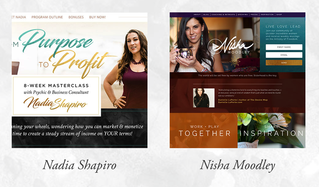
To give your visitors a bit of reprieve, it’s a good idea to separate your dense, photo-heavy sections with clean, content-driven white space sections. Check out the “Passions” homepage screenshot in the Style Inspiration preview to see an example of how to do this correctly.
Not enough photos to go around
Since this is a very photo-dense style, you need a lot of different options to choose from. I don’t just mean lots of different portrait shots to choose from – you also need variety in the types of photos you take in the first place.
This means you can’t just slap 30 photos of your face on a page and call it a day. You need some close-ups of you working with your hands, engaging with a hobby of yours, and LOTS of environment shots that don’t show your face or body at all. Think altar or desk shots to compliment you working / burning incense / throwing Tarot / whatever.
If you’re looking to take better promotional photos in your next shoot, here’s a super handy FREE guide I created for that exact purpose.
Mismatched design features
It’s an extremely daunting task to DIY this style without real world design experience. Hell, I’m a professional designer and I’m still challenged by every Visual & Vintage brand that comes my way.
It’s possible to hire a great photographer and DIY your Visual & Vintage site without help from a web design pro, but you really need to make sure your photos are absolutely killer.
What could happen when a novice sits down to design this kind of website? She starts to experiment.
Suddenly she wakes up 24 hours later in front of her computer, with a website homepage that could have been cobbled together by 4 different people with varying degrees of sanity.
Creating an overarching design theme is critical with this kind of style, so if you’re hellbent on the DIY route, think big, focus on finding inspiration to follow, and whatever you do – keep your design consistent across your entire brand.
Ideal fonts & colors
Any nice-looking combination is fair game with this Signature Style. Since it all depends on the audience you’re looking to target. I personally have an entire collection of interesting vintage / old school fonts that are totally unique and visually intriguing, especially when used in logo designs.
As I mentioned above, brush and script fonts work well with this style too. There’s really no limits to what fonts work with these types of designs.
Since this style is visually dense, you’re going to want to have a lot of options when it comes to color. There’s usually one, maybe two pop colors, usually not too bright or garish. Earth tones such as teal, blue-green, gold, maroon, and burnt orange are especially popular with this style. And they compliment the “boho” feel many Visual & Vintage brands go for.
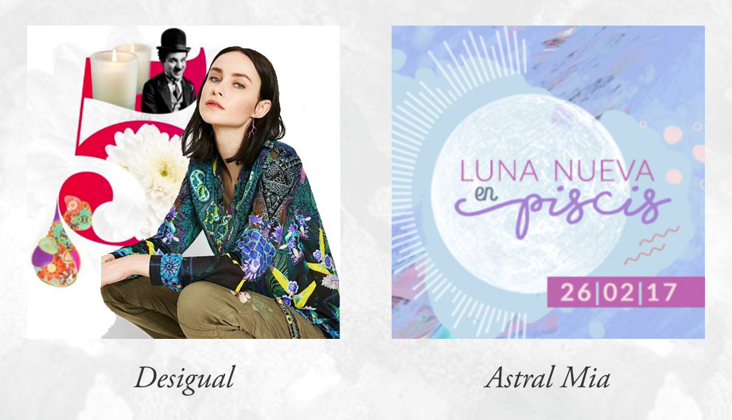
Brands to be inspired by
These are some of my absolute favorite brands! All my winter coats come from Desigual, and help to brighten up the streets whenever I’m out ‘n about on a grey snowy day in Brooklyn.


One Response